I’ve been taking a new cartooning course, and our first project involves scripting and thumbnailing. So I’ve been thumbnailing over the past few weeks.
Ty always argued that thumbnails should take you 10 minutes. They take me quite a bit longer than that. I’m also weird in that I really like figuring out my lettering early in the process, ’cause I hate lettering that doesn’t fit into the panels.
Mostly my thumbnails start very scribbly, and then I refine them as I want to figure stuff out. Some parts I just leave as scribbly if I have a clear idea of what it’s saying. Stuff that involves a lot of environment, I end up spending more time on.
So, um. I was kind of waiting for Andrew W. or Steven A. to post about this first, but they seem to be busy with other stuff and I'm just so excited I can't sit on my hands any longer. _Shout Out_ has been nominated for a Prism Award for best anthology. pic.twitter.com/SBzLeMZQVX
— BC Holmes is on Mastodon and BlueSkey (@bcholmesdotorg) August 23, 2020
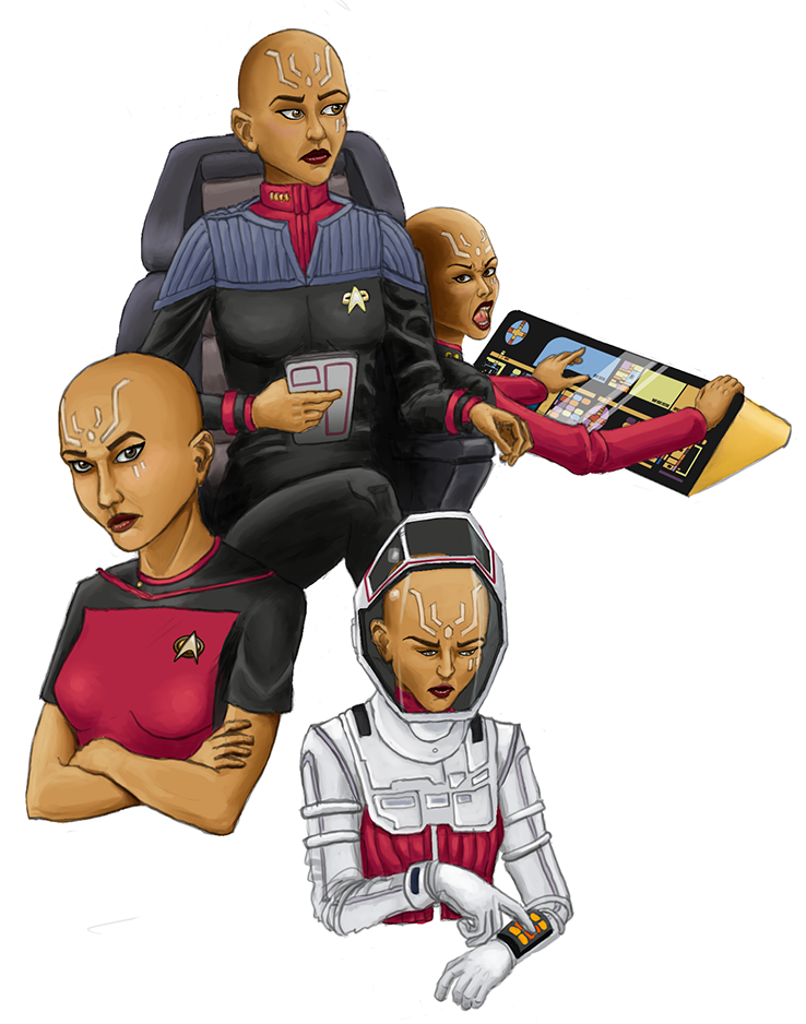
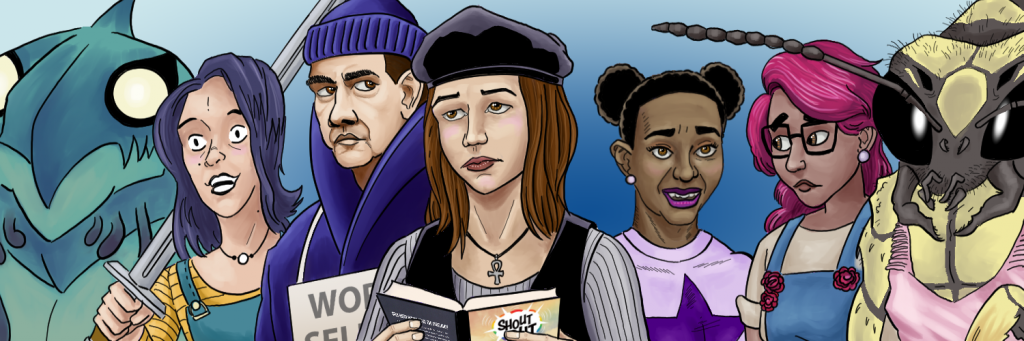
I decided I wanted to refresh my Twitter banner, and I decided on a “TO Comix and me” theme.
So the new banner includes a bunch of characters I created and/or co-created while working on various TO Comix books.
[a group of five human figures and two monsters, each of whom has appeared in a various TO Comix stories over the last few years]
Some of my co-creators include Xan Grey, Brenna Baines, Dee Williams and Meaghan Carter, and Alex Moore.
I wrote all of these characters, and it’s pretty seductive to think “before I came along, nothing about these characters existed, but then I put them in the story, and now they exist, and therefore I created them.” But the artist contribution to characters is pretty important and writers need to acknowledge their contribution.
I remember the early eighties, when “creator owned content” was a huge deal. Marvel and DC resisted the idea, because they wanted to claim ownership of all the characters created for them. (DC finally partially relented and credits creators of individual characters according to some byzantine rules). Marvel has little interest in acknowledging individual creators other than Stan Lee (and now, thanks to a lawsuit settlement that avoided a supreme court hearing, Jack Kirby). And they’re the big two. Most of the 80s-era creator-owned content publishers died out (although some of the stuff created in that era, like the Teenage Mutant Ninja Turtles, continues to be thriving properties.
I like Clip Studio Paint, and it’s my go-to tool for comics work. But that’s not to say that I’m not occasionally underwhelmed by some of its features. I have the Ex version. Here’s a list of 10 things I wish were better about Clip Studio Paint.
1. Weird brush settings
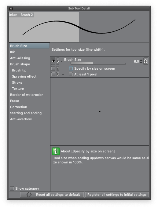
There are some default brush settings that I find really annoying, and it’s especially annoying that they’re default options.
The one that I find most irritating is the setting that makes brush sizes relative to zoom. So if I pick my favourite inking brush and expand it out to 30px — which means that at maximum pressure, the brush is 30px across (unless you’ve turned off pressure sensitivity) — the size is based on screen size, not paper size. So if I zoom in, 30px on the screen represents a larger area of the paper, and the weight of the line appears a lot heavier. If you want consistent line weights, zooming in screws you up. Suddenly everything you’ve inked at the zoomed-in scale is heavier than the lines you ink while zoomed out. I’m sure that there’s a scenario where you might want that, but I suspect that they’re rare. Nonetheless, this option is turned on by default.
I’ve personally found the pen pressure settings to be far too sensitive, and I tend to tweak the pen pressure sensitivity settings on my favourite brushes to reduce the amount that they respond to pen pressure. One of the YouTube artists that I follow, Sara Tepes, uses Krita and her main brushes have pen pressure sensitivity turned off. I don’t think I’m the only one who struggles with pen sensitivity; I suspect that a lot of the “what brushes do you use?” questions are really “when I try this, the brush size goes out of control” complaints. Read more
Our publisher, Steven Andrews, has done an amazing job on the Kickstarter planning as well as organizing the graphics, rewards, and video script. He’s hired a very good video editor: the video looks really nice. And he showed up at the launch party with some preview samples. (They even say “Special Preview” on the cover!).
The response to the Kickstarter has been amazing. As I’m writing this, we’re thisclose a third-of-the-way funded on day one.