This week, the Shuster Award nominations were announced, and for the third year in a row, the Toronto Comics anthology has been nominated for the Gene Day Award for self-published comics. We’ve lost out the last two years, and I don’t really expect this year to go any differently but, as they say, it’s an honour to be nominated.
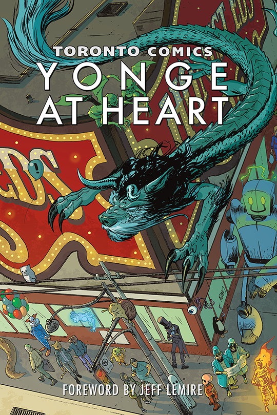 Because of eligibility date requirements, the nomination was for Volume 3, which came out in 2016. But it’s 2017 now, and there’s a fourth volume. This year, the editors dispensed with the “Volume X” subtitle, and gave the book its own swanky subtitle: Yonge at Heart! This year’s book is a bit smaller (in a “number of pages” sense) than previous years, but what it lacks in pages it makes up for with vibrant colour! And, boy howdy, does that colour make for some gorgeous pages.
(I don’t want to play favourites, but the colours on Derrick Chow’s pages for his story “Break and Enter” are absolutely gorgeous).
So I thought I’d talk a bit about the process. I had been fortunate to have a story in each of the three previous volumes, so I have a bit of an advantage in that the editors know my style and have a pretty good idea of how much editing effort they’re in for if they choose my submission. So that’s a thing that works in my favour. But I still start the process the same way as the others: I send off a proposal.
I think it was in early-to-mid-August that submissions were open. I sent in two proposals. My first proposal was called “Marching in the Streets” and I suggested it as a reflection on three different instances where I was out occupying the streets with thousands of my closest friends. The three events I was interested in exploring/contrasting were Pride, the G20 rally and the funeral of Jack Layton. I thought there might be some interesting thoughts to explore, there. My second proposal was for a story called “Housing Challenge”. In the proposal, I basically described a near-future Toronto where getting housing is so difficult that people go on reality TV and fight each other in giant robot suits to win a condo. Y’know. As one does.
On August 21st, I received an acceptance and a deadline. The editors chose “Housing Challenge” probably because it’s the more fun of the two. First draft was due two weeks later on Sunday, September 4th. Lead editor Steven Andrews was the editor in charge of my story (the three editors of Volume 3 divvied up the pieces). On September 8th, Steven messaged me on Facebook with some revision requests (he makes really good editorial notes), and asked for a second draft. Nothing too dramatic, though. My second draft was due on the 17th, and Steven accepted it as final.
At about the same time, Steven shared all of the first drafts with the various artists who signed up/were selected. The artists picked and ranked the stories they liked and after some tallying, Steven went back to the writers with lists of artists to choose from. By the 20th, Steven messaged me with a list of 6 potential artists interested in illustrating my script and links to their portfolios. I was spoilt for choice.
And it was a hard choice. But there was something about Brenna Baines’ portfolio that really caught my eye. She has a clean and loose style that I really liked. It helped that all of her portfolio pieces were in colour, so I had a good idea of what the final look would be. And she’s also apparently a huge Transformers fan, so she already had some giant robot images that gave me a sense of how well she’d approach the robot battles. So she was at the top of my list of selections.
Turns out, my script was her first choice as well, which I discovered in a Radio Free Krypton interview with Brenna and some of the other folks who worked on the book.
Working with Brenna was great. Her earliest character designs were right on point.
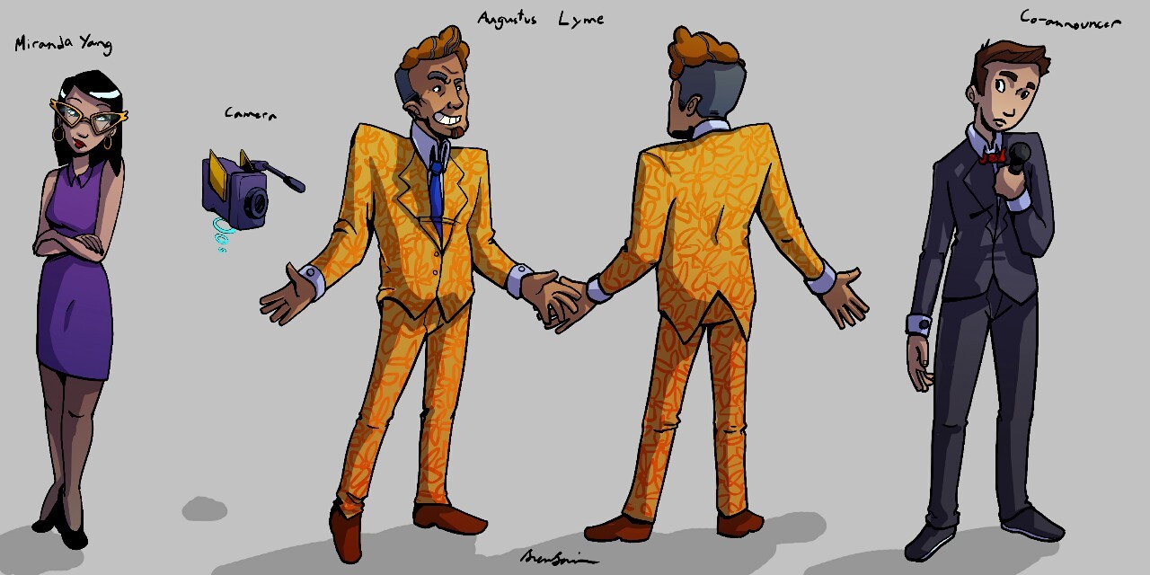
It’s weird that the character I think of as the “main” character doesn’t really dominate the script. The story has a framing sequence, and the key character from the framing sequence is probably the one who has the most dialog. My script starts with two characters, Augustus Lyme, the reality TV announcer, and an interviewer, Miranda Yang. In my script, I describe Augustus as “an unholy union of Cesar Flickerman from the Hunger Games and Don Cherry.” Of Miranda, I say, “I imagine her looking vaguely like Rita Skeeter from the Harry Potter films, with glasses that she can stare over the top of.”
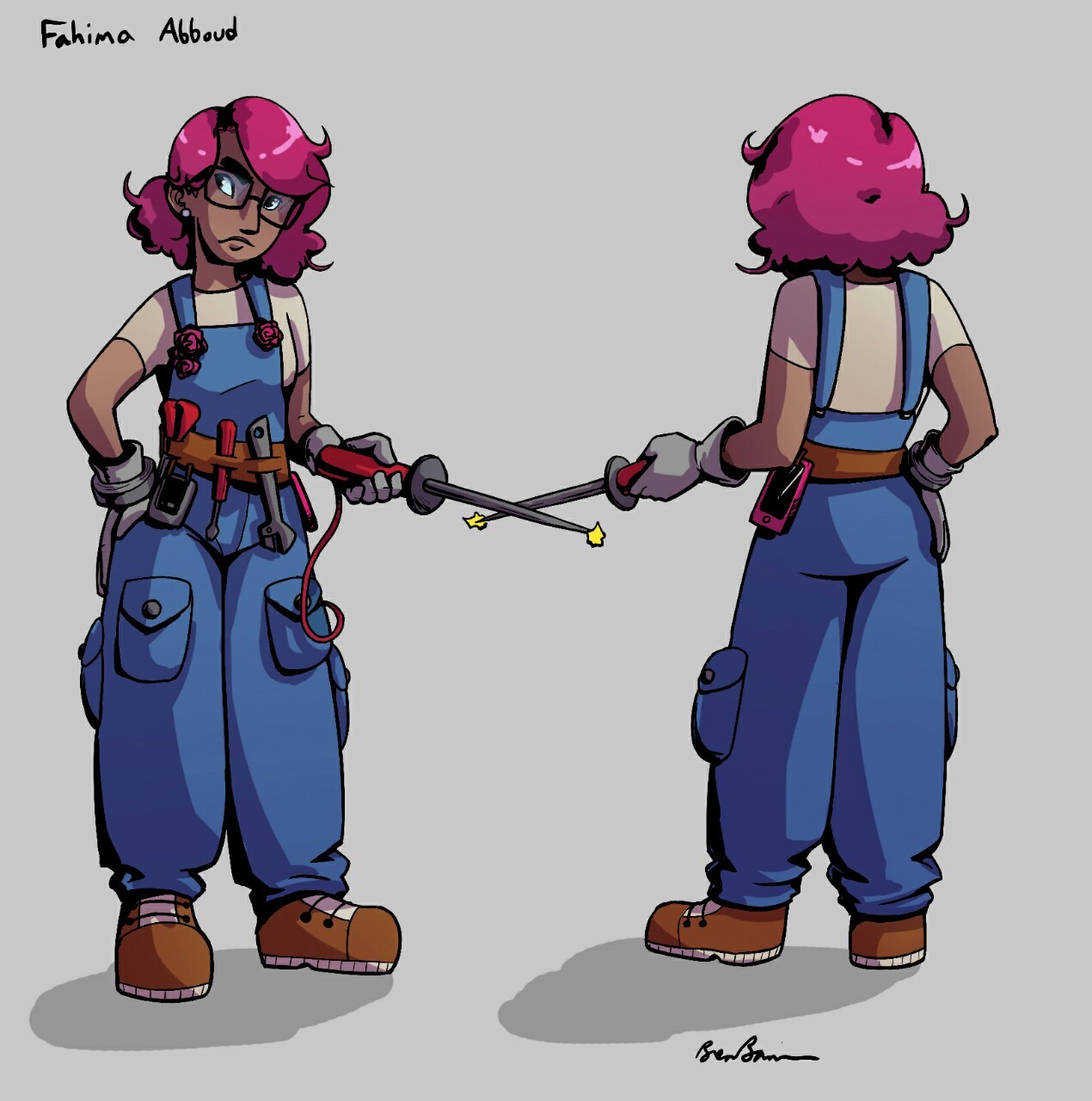
The character I think of as the main character is our competitor, Fahima Abboud. In my script I say, “She has overalls with various tools and electronic devices in pockets and hanging off of belt loops. But she’s not a complete tomboy — I think she has more decorative flourishes in her outfit. I think my mental model for her is probably a bit like Limor Fried, with a soldering iron in one hand and cute glasses and coloured hair.” I am delighted to death with Brenna’s character design for Fahima. I am completely dead from the little flowers where her overall straps attach to the front piece.
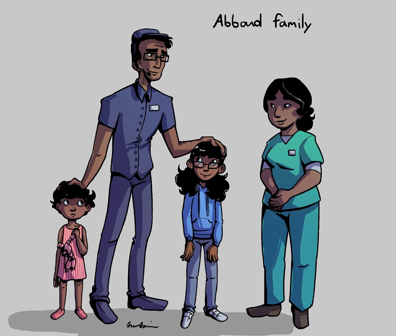
My script said very little about Fahima’s family, who appear fairly briefly in the story. But the adorbs-factor on those younger siblings is off the scale.
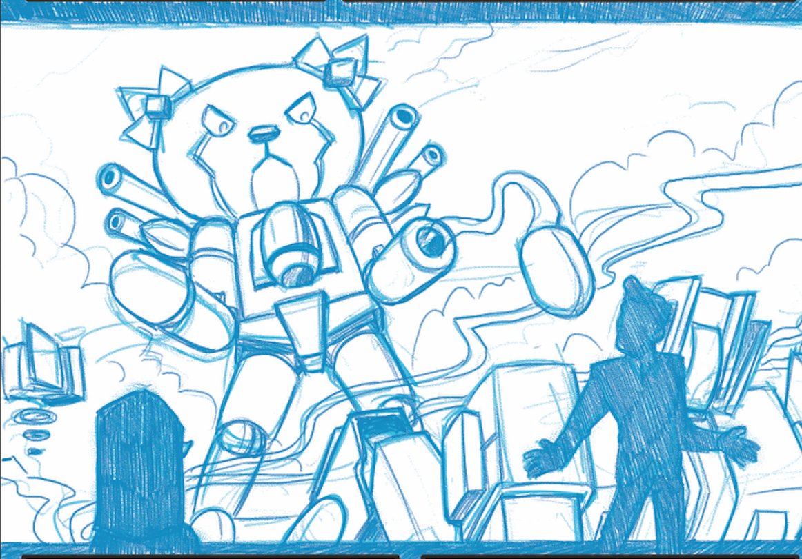
KittenBot was a relatively late addition to the script (and played a fairly minor role), but Benna’s design was so good, I think Steven has used that image for every bit of promotional material that mentioned “Housing Challenge”:
A ferocious Kittenbot from @pangolinart and @bcholmesdotorg's Vol 4 story! Mew mew pew pew. #makingcomics #toronto #hellokitty #mecha pic.twitter.com/aC6OfhGgBn
— TO Comix Press (@TorontoComix) February 19, 2017
(Script description: “One of the mechs is teeth-rottingly cute, like a giant plastic Hello Kitty, but with scary-looking weapons attached at various locations around its body.” Nailed it.)
After character design, Brenna had a few deliverables. The next stage is “thumbnails,” where the artist does a quick sketch of what the page layouts would look like. Thumbnails are a very rough stage (Ty used to tell us that you shouldn’t spend more than an hour on them. Hm.) and should be quick and easy to revise and update. I don’t quite remember what the thumbnail deadline was, but I have an email with Steven’s notes on the thumbnails from November 2nd of last year.
 After thumbnails, the next deliverable was “pencils” where each page is drawn out in full. Pencils usually aim to be fairly clean, but a bit of roughness is allowed. Whereas thumbnails are usually small — I’ve seen some artists thumbnail 8 pages on a 8½”x11″ pieces of paper — pencils are usually full sized. Before digital, artists would usually pencil pages at 1½ times size, and then the pages would be reduced going in to publishing. When I work digitally, I still draw at 1½ size, but many folks don’t see that need. Brenna’s deadline for pencils was December 11th.
 After “pencils” the next stage is “inks”. Once inks are done, the pages should be clean, black-and-white images. I *think* the deadline was latish December. And then the final stages were colours and letters. Colouring was a stage that really made Brenna’s pages pop. One of the things I thought was interesting about Brenna’s colours was the way she coloured her background inks. That is to say, in several images, items in the extreme background (skylines, and what-not) replaced the black ink linework with coloured lines in a darker shade of the item’s local colour. She also did a cool colour treatment of an interweaved interview — there’s a more muted colour scheme that she uses in those
Steven asked me to help out with lettering, which I did. When I letter my own stuff, I put the lettering in very early, so that I can be sure that my dialog fits. I do find it a bit trickier to letter someone else’s pages, but I don’t mind doing it.
Pretty much everything was in place by the time the editors launched a Kickstarter for the book at the beginning of March. The Kickstarter ask was higher than last year: the move to colour increased the costs a fair bit. The behind-the-scenes stuff for organizing the Kickstarter seems like an arcane art. Steven coordinated a video, and designed rewards, and lined up a fair number of interviews with podcasts and the like. He also released a couple of the stories to give people a free taste of what the book was going to be. One story about the TTC’s monster-fighting division really seemed to catch the public interest (even being covered in the CBC). It didn’t hurt that the TTC’s Executive Director of communications tweeted about it:
https://twitter.com/bradTTC/status/847175381199269888
One of the stories that was release was “Housing Challenge”. Sadly it didn’t seem to make quite the same splash as “Signal Problems”. But you can read Brenna’s and my story for free! On the Intertubes! (But buy the book if you can, ’cause it’s a cool collection of pieces).
And finally, at TCAF in May, the books were officially launched. TCAF has usually been a great venue for Toronto Comics. It really is the premiere indy comics venue. It’s weird how, for example, Toronto Comicon really doesn’t have a focus on comics: it’s more about media and celebrities. I’m often surprised by how hard it is to find a good indie book in the comic artists alley at cons like FanExpo and Comicon.
A few weeks ago, I commissioned a new image of Fahima from Brenna: she’d put out a call for commissions and I thought it’d be neat to get a good image of this character that we created.
Commission of our wonderful girl Fahima for @bcholmesdotorg! Thanks again! pic.twitter.com/JHo4UCZMlB
— Brenna 🎉🐀🐁 (@pangolinart) July 6, 2017
That was thrilling. As a comics newb, I appreciate your guiding me through the journey.
When you say “help out with the lettering,” how do you do version control on the art files?
Version control isn’t quite as clear-cut as it might be in a software development world. Basically, the page art and the “page art with lettering” can evolve in parallel.
For example, I did much of my original lettering on Brenna’s inked pages. I letter in Illustrator, so I create a document with Brenna’s art as PNGs as the base layer (largely as a guide), and then I build all of my lettering as vector layers above that. Illustrator doesn’t love PNGs quite that much so I export my lettering layers to Photoshop, and plop them all together.
As new versions of the art came out, I could just replace the art layer. Sometimes I needed to revise the lettering as things changed in the art (there was one panel, for example, where Brenna reversed the positions of two characters fairly late in the game. I went back to Illustrator and revised the lettering for that page, and re-exported those layers to Photoshop).