Over the last few days, I’ve been trying to get my head around digital lettering. At one level, this doesn’t seem like a hard topic. I mean, I’ve been dropping words on computer screens for a long, long time. But I’m really interested in figuring out what people in the comics industry are doing: what are typical workflows? Best font sizes?
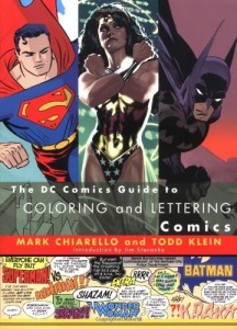
To get some insights into the topic, I picked up a copy of The DC Comics Guide to Coloring and Lettering by Mike Chiarello and Todd Klein. I must confess that I was pretty disappointed. A big part of what the book has to say about lettering is about the debate between hand-lettering versus digital lettering. And I suspect that that conversation is kinda dead. Ah, well. The book is from mid-2004: it’s interesting how quickly dated it’s become.
It’s even true that in the part of the book that talks about digital lettering, there’s more space devoted to how to create your own font than to the best practices of, for example, creating balloons. And, y’know, I find the idea of font creation interesting, but I’m a touch disappointed in the book in general — especially given the status Todd Klein has in the world of lettering. The one key piece of info that I took from the book was that he favoured lettering at original art size, using an 11pt font with a leading (line height) of 11.5.
I find myself increasingly jumping to YouTube to find interesting material on digital art topics; there are some great videos out there. For my part, I think Scott McCloud‘s two-part video tutorial is probably the best tutorial that I’ve seen:
His technique is really interesting, and he gets into a lot of little details to help make the end result shine. The only thing he doesn’t really talk about is font sizes. He mentions in the part 1 video that he’s using a font designed from his handwriting (created by John Roshell) — you can buy it! But no real discussion about font sizes.
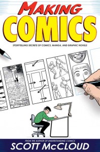
It’s also true that his workflow looks like it’s different than a lot of people’s workflows might be. As he describes in Making Comics, he does a fairly tight set of layouts first, and then scans those. You can see how he uses the layouts as his guides in the Part 2 video. But, unusually, before he’s doing anything with finished art, he’s doing both borders and lettering: the lettering is pretty early in the process.
Conveniently, on Monday night, @ktsssssmith was at the Comic Book Embassy just before class started up, so I started asking her a bunch of questions. She told me that she usually lettered on the reduced art (comic pages are printed at about 2/3rds the size of the original art), using a 6.5pt font. She and Ty explained that, back in the hand-lettering days, lettering happened at 10pt on the original pages, which led to a reduced size of ~6.7pt. When things cut over to digital lettering, they said, the size was kinda rounded off to 6.5pt on the reduced art. Keiren did add, however, that online comics were encouraging larger lettering sizes. Innnnteresting.
Keiren also sent me a pretty good list of lettering resources:
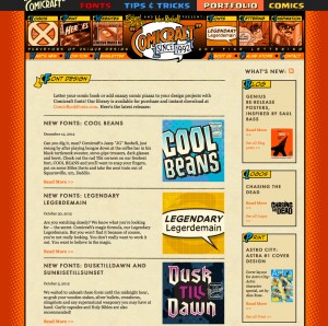
Richard Starkings’ Comicraft fonts site. Keiren says that Richard Starkings is one of the first big proponents of digital lettering — I didn’t know that. They’ve got a lot of fonts for sale over here. And there are online tutorials over here.
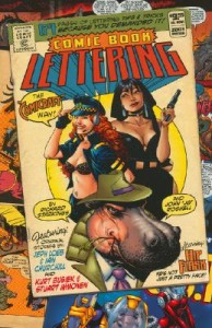
Comic Book Lettering: The Comicraft Way — Comicraft’s book on the topic. Looks like it’s only 63 pages, but I’m interested.
Blambot is Nate Piekos’ site, with bunches of fonts. Keiren writes:
Once you see Bada Boom, you’ll realise you’ve seen it EVERYWHERE.
And finally, a mind-blowing number of fonts from Ray Larabie. More commentary:
Ray Larabie is a Canadian who loves fonts. Loves them so much he designed 600+ families of fonts and made them available for free online. Many of the freebie fonts available on various download sites are Ray Larabie fonts. Some of his display fonts are the best…
