Tag Archive for art is why i get up in the morning

Consummabis Opus Vestrum

I think I want to post more of my art. Both because it gives me a firm reason to get more stuff into a state that feels approximately finished, and because I believe that putting art into the world is a good thing. I just need to get over the fact that sometimes I spend time on art that’s nerdy and fanfiction-y.

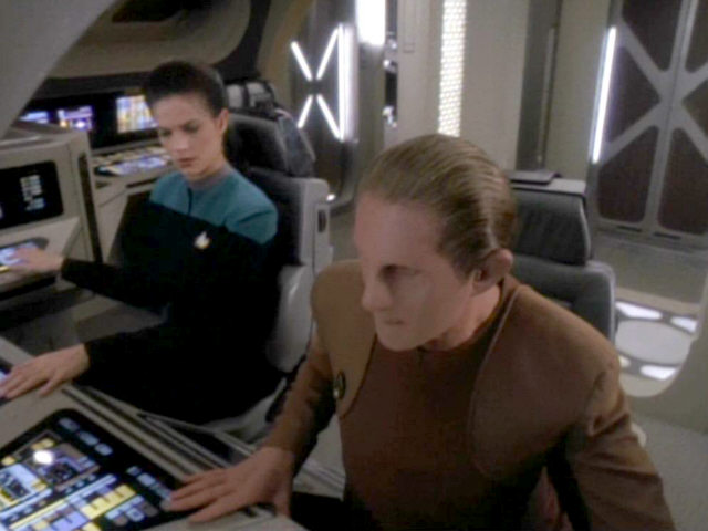
Here’s a piece that I finished recently. I drew it as part of a Star Trek table-top RPG that I’m currently playing in. Four of our characters went off in a shuttle to investigate stuff in a nearby planetary system.
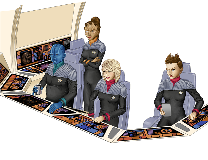
I tend to nerd hard on some of the details. Our heroes are flying off in an Argo-type shuttle (seen in Star Trek: Nemesis, possibly the least-loved TNG film). We’ve never seen the inside of the Argo, but I speculated that it looked a lot like the Danube-class runabout (the runabout set was redressed as the Type-11 shuttle for Star Trek: Insurrection).

So that lets me use reference like so:
Read more

Clip Studio Tutorial Video

I think I first encountered this video at least a year ago. Maybe two. It’s one of a series that Smith Micro Graphics made to raise the profile of Manga Studio (now called Clip Studio Paint and Manga Studio Ex is now called Clip Studio Pro).

The presenter is an artist by the name of D.M. Cumbo, who has been working on an illustrated story called Dreamside. At about the time that Smith Micro released the video, D.M. Cumbo was also making a number of videos about different Manga Studio techniques, but he’s gone a bit quiet on that front lately.

Cumbo’s art really stands out to me because of the vibrancy of colour that he achieves. In a later video, he says that vibrancy is really all about contrast, and that picking colours that contrast well is the key to creating vibrant images. He also really pushes the idea of bounce-back lighting in a number of his videos: he says that things really look “in the environment” when you can see the colours of the environment reflecting back on a figure or object in that environment.

There are three techniques that Cumbo describes in this video that interest me:

Read more

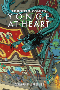
Toronto Comics: Yonge at Heart

This week, the Shuster Award nominations were announced, and for the third year in a row, the Toronto Comics anthology has been nominated for the Gene Day Award for self-published comics. We’ve lost out the last two years, and I don’t really expect this year to go any differently but, as they say, it’s an honour to be nominated.

Because of eligibility date requirements, the nomination was for Volume 3, which came out in 2016. But it’s 2017 now, and there’s a fourth volume. This year, the editors dispensed with the “Volume X” subtitle, and gave the book its own swanky subtitle: Yonge at Heart! This year’s book is a bit smaller (in a “number of pages” sense) than previous years, but what it lacks in pages it makes up for with vibrant colour! And, boy howdy, does that colour make for some gorgeous pages.

Read more

Comic book artist rates

This is a good set of links and interpretations about rates for comic book artists.

Generally, the good graphic novels fetch $100 – $300 per page, although professionals who have been in the industry for a long time can command as much as three times that amount. In fact, one elite illustrator commanded as much as $1,000 a page (on a 22-page comic book)! Most of the popular titles that artists, like David Cassaday, work on are monthly issues, which end up providing him with a six-figure salary. The back-end royalties on merchandise, trade paperbacks and movie royalties are also generous.

Inking experiment 1

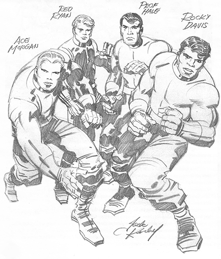
I tried my hand, this weekend, on a particular technique for digital inking using Illustrator. I started with a pencil sketch by Jack Kirby (published in one of the Jack Kirby reader books).

Original Pencils by Jack Kirby

I scanned the image and popped it into Illustrator, then saturated it with blue, to make it easier to differentiate the pencils from the inks. I downloaded a specific Illustrator template from Cartoon SNAP, and tried out their inking brushes. Here’s an image in progress:

Read more

More on comic book lettering

I’m continuing to practice different things related to constructing comics. As a simple lettering exercise, I decided to re-letter my final assignment from my cartooning programme.

In this case, I’m retaining the original hand-drawn caption boxes, but I’ve whited-out the original uneven hand-lettering and plopped in some new lettering. I’m using a 12pt font — specifically a font called Digital Strip by Blambot. 12pt is closest in height to the original hand lettering. (To be clear: that’s 12pt on the original art size of 11″ x 17″) I’m also using a bit of Engravers MT on page 4. In almost all cases, the computer lettering is more compact than my hand lettering, so the caption boxes are sometimes a bit empty-seeming.

There are things about Illustrator that I find irritating and more complex than necessary. Like, why do I use different tools to add path points and remove path points? Inkscape feels ever so much better at this to me. But whatever. A tool’s a tool.

Read more

Going digital

I’m currently on vacation. Which, y’know, is pretty awesome. I spent a coupl’a days in do-nothing mode, sitting on my couch and watching movies. Which is about all that I’m capable of when work has drained me somewhat.

But now I’m in pet-project mode: I want to focus on something interesting. My pet project has been about going digital on the cartooning stuff. None of the instructors I’ve had have been terribly positive about computer-based art. Anthony (my primary instructor during my cartooning programme at George Brown) didn’t quite poo-poo digital art, but fundamentally believed that one had to learn how to draw using traditional tools before learning digital art. He also felt that most of the computer-produced art that he’d seen was very flat and lacked expressiveness.

Ty hasn’t taught us anything related to computers — he seems to draw and ink using traditional media, but he uses tools that Anthony would have turned his nose up at (markers! Pen brushes! Oh noes!) Ty also seemed to think that it was pointless to learn hand-lettering because nobody hand-letters these days. (I notice that Bechdel’s Are You My Mother? seems computer-lettered, whereas Fun Home looked hand-lettered). And Ty’s Bun Toons often include digital colouring and probably a bunch of other computer tweaks. So he seems more pragmatic about the use of computers than Anthony ever did.

Read more

Barely sit still or hold a thought in my head

I must have really turned a corner on my apprehensions of my Writing class because I’m really excited about tomorrow’s class and I CAN’T WAIT.

Writer’s Workshops at WisCon

What do people think of the Writer’s Workshops that take place at WisCon? Has anyone on my friends list tried one? Impressions?

Jack Kirby versus Picasso

They call him “King” Kirby!