Tag Archive for clip studio

Thumbnailing

I’ve been taking a new cartooning course, and our first project involves scripting and thumbnailing. So I’ve been thumbnailing over the past few weeks.

Ty always argued that thumbnails should take you 10 minutes. They take me quite a bit longer than that. I’m also weird in that I really like figuring out my lettering early in the process, ’cause I hate lettering that doesn’t fit into the panels.

Mostly my thumbnails start very scribbly, and then I refine them as I want to figure stuff out. Some parts I just leave as scribbly if I have a clear idea of what it’s saying. Stuff that involves a lot of environment, I end up spending more time on.

Read more

ProCreate

Meaghan Carter has some interesting thoughts about ProCreate for the iPad.

10 Things I Wish Were Better in Clip Studio

I like Clip Studio Paint, and it’s my go-to tool for comics work. But that’s not to say that I’m not occasionally underwhelmed by some of its features. I have the Ex version. Here’s a list of 10 things I wish were better about Clip Studio Paint.

1. Weird brush settings

There are some default brush settings that I find really annoying, and it’s especially annoying that they’re default options.

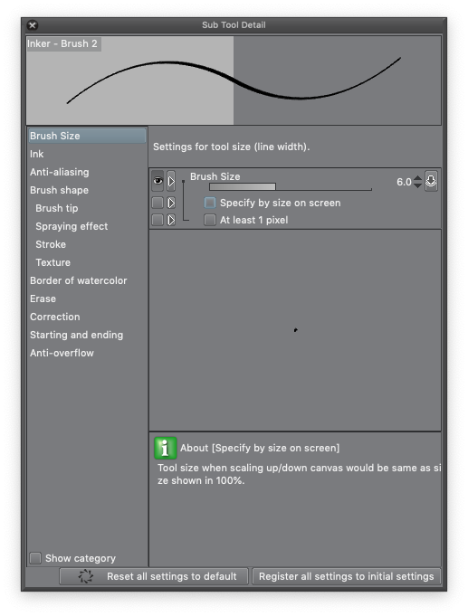
The one that I find most irritating is the setting that makes brush sizes relative to zoom. So if I pick my favourite inking brush and expand it out to 30px — which means that at maximum pressure, the brush is 30px across (unless you’ve turned off pressure sensitivity) — the size is based on screen size, not paper size. So if I zoom in, 30px on the screen represents a larger area of the paper, and the weight of the line appears a lot heavier. If you want consistent line weights, zooming in screws you up. Suddenly everything you’ve inked at the zoomed-in scale is heavier than the lines you ink while zoomed out. I’m sure that there’s a scenario where you might want that, but I suspect that they’re rare. Nonetheless, this option is turned on by default.

I’ve personally found the pen pressure settings to be far too sensitive, and I tend to tweak the pen pressure sensitivity settings on my favourite brushes to reduce the amount that they respond to pen pressure. One of the YouTube artists that I follow, Sara Tepes, uses Krita and her main brushes have pen pressure sensitivity turned off. I don’t think I’m the only one who struggles with pen sensitivity; I suspect that a lot of the “what brushes do you use?” questions are really “when I try this, the brush size goes out of control” complaints.
Read more

Clip Studio Tutorial Video

I think I first encountered this video at least a year ago. Maybe two. It’s one of a series that Smith Micro Graphics made to raise the profile of Manga Studio (now called Clip Studio Paint and Manga Studio Ex is now called Clip Studio Pro).

The presenter is an artist by the name of D.M. Cumbo, who has been working on an illustrated story called Dreamside. At about the time that Smith Micro released the video, D.M. Cumbo was also making a number of videos about different Manga Studio techniques, but he’s gone a bit quiet on that front lately.

Cumbo’s art really stands out to me because of the vibrancy of colour that he achieves. In a later video, he says that vibrancy is really all about contrast, and that picking colours that contrast well is the key to creating vibrant images. He also really pushes the idea of bounce-back lighting in a number of his videos: he says that things really look “in the environment” when you can see the colours of the environment reflecting back on a figure or object in that environment.

There are three techniques that Cumbo describes in this video that interest me:

Read more