Yet another Star Trek item that I’ve modelled.
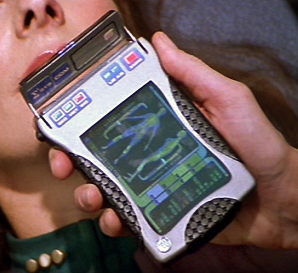
In Star Trek: Nemesis, they created a new prop for the tricorder. The “flip phone” style of tricorder was replaced with one that more resembles a smart phone (albeit with a small part that flips open at the top).

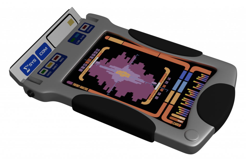
I tried my hand at modelling this in SketchUp some time ago, but never really got to a place where I was happy with it. Here’s my initial pass at a Blender version:

Some thoughts:
First, limitations. I’m interested to try my hand at the circle-grid texture of the rubber grips. It feels like something one should do with normal maps. I’ve never created a normal map. There’s a first time for everything, but I’m not quite there yet.
Similarly, there’s a bit of texture on the small round button in the lower left-hand corner of the tricorder. Also a good candidate for normal mapping.
Because this tricorder only ever appeared in one movie, it’s not commonly seen. But Trek fans are Trek fans, and some folks have made interesting replicas. An interesting thing about the replicas: sometimes they’ve added a bit more detail than appears in the original prop. For example, the blue labels on the original prop are just stickers: you can see that if you look carefully at the still image above. I’ve seen (images of) replicas that have LED lights and recessed portions. I’ve treated them more like stickers than anything else.
One other thing I tried out: I wanted to try something new with the LCARS display: I’ve made it emit light, but I also wanted it to be glossy. So I mixed an emission shader (a light-emitting mechanism) with a standard shader (with glossiness) together. The glossiness doesn’t really show up (because there’s no environment to reflect), but you can see how the orange light is being cast up onto the sides of the recessed portion. Sadly, the mixing seems to have made the colours a bit dull. I’ll look in to that.
Things I don’t yet love: UV-unwrapping. Especially when it’s in tandem with subdivision surface modifiers.
