I’m continuing to practice different things related to constructing comics. As a simple lettering exercise, I decided to re-letter my final assignment from my cartooning programme.
In this case, I’m retaining the original hand-drawn caption boxes, but I’ve whited-out the original uneven hand-lettering and plopped in some new lettering. I’m using a 12pt font — specifically a font called Digital Strip by Blambot. 12pt is closest in height to the original hand lettering. (To be clear: that’s 12pt on the original art size of 11″ x 17″) I’m also using a bit of Engravers MT on page 4. In almost all cases, the computer lettering is more compact than my hand lettering, so the caption boxes are sometimes a bit empty-seeming.
There are things about Illustrator that I find irritating and more complex than necessary. Like, why do I use different tools to add path points and remove path points? Inkscape feels ever so much better at this to me. But whatever. A tool’s a tool.
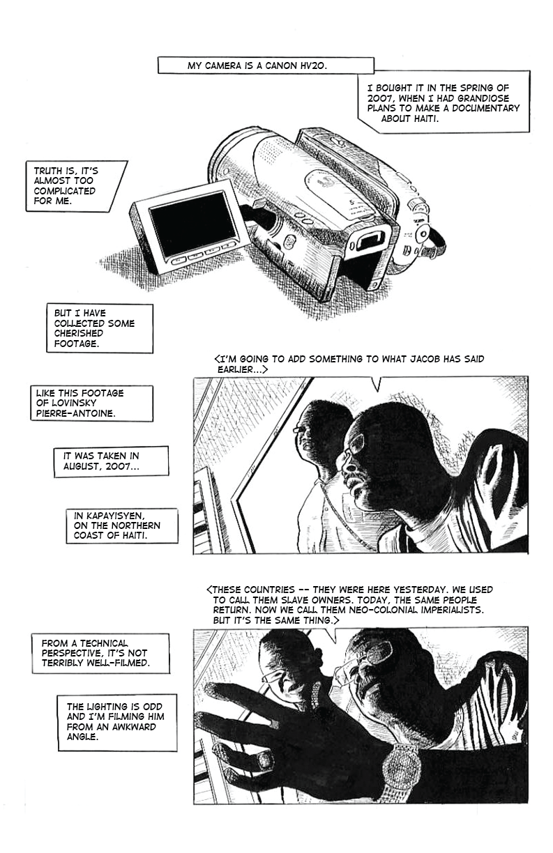
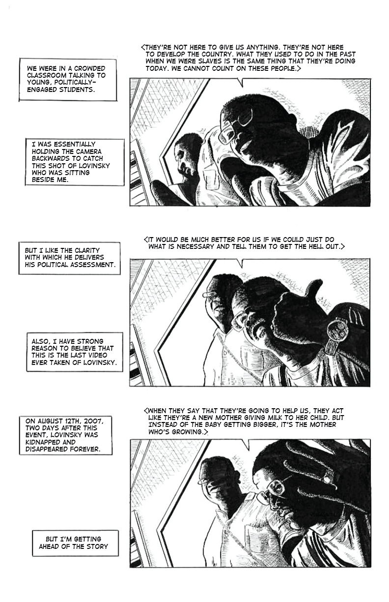
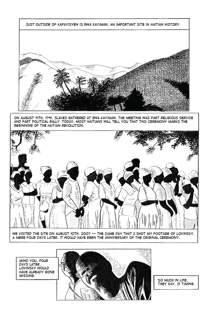

I suppose that it’s a sign of progress that I’m kinda embarrassed by this art. Some of the panels I’ve never loved. But at the time I did these pages, I really liked them.
One last finding: for this conversion, I tended to “type over” the original words to add the new lettering. Seeing both the new lettering and the original lettering at the same time, as I typed, caused me to fail to notice a number of spelling mistakes I was making. It was only after I assembled these pages into this blog entry that I started noticing a number of spelling errors that slipped into the final images. So I had to correct and re-export some of these pages a few times. I suspect that workflow will look different for future lettering exercises, but it was kinda embarrassing.