Today is Blender Day. Version 2.82 should be released later today.
I’m pretty much a noob with Blender, but I decided a while back to switch from SketchUp to Blender for various reasons. I’ve grown some pretty good SketchUp experience, so it’s sad to fumble around with basic stuff again.
One of the earliest things I modelled in SketchUp was a table from Voyager. I chose it because it was mostly simple but had a few complicated bits. I was also lucky to find a good photo of one of the real props (which included some dimensions).
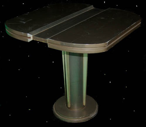
And the resulting SketchUp model ended up mostly okay, but with some deficiencies that I was aware of:
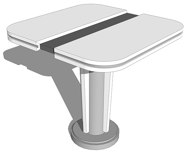
So, I thought, why not try the same thing again? Here’s the basic model of the table in Blender:
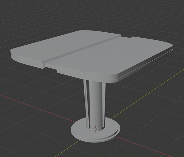
One of the things I tried to improve upon from the SketchUp model is I wanted to get that asymmetric corner curve: it turns out I went too far, and it looks flatter than the reference photo. (Ironically, I’m aware of new enhancements to the bevel tools in 2.82 that’d make this kind of corner easier for me).
But one of the things I can do in Blender that I can’t do in SketchUp is more realistic texturing and rendering. And here I barely know what I’m doing. The reference photo is shot under some pretty weird lighting, and its colours aren’t indicative of how the table looks on the show.
My texturing is tremendously simple: I’ve merely applied basic materials to the object and dropped in a basic lighting environment:
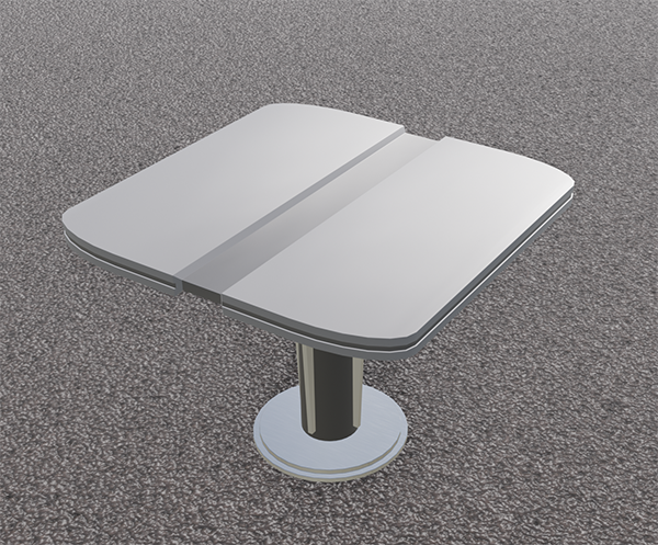
It looks pretty flat. The metallic material on the base is reflecting a shit-ton of light, so it just looks white. Oh well. It’s a process.
