I think I first encountered this video at least a year ago. Maybe two. It’s one of a series that Smith Micro Graphics made to raise the profile of Manga Studio (now called Clip Studio Paint and Manga Studio Ex is now called Clip Studio Pro).
The presenter is an artist by the name of D.M. Cumbo, who has been working on an illustrated story called Dreamside. At about the time that Smith Micro released the video, D.M. Cumbo was also making a number of videos about different Manga Studio techniques, but he’s gone a bit quiet on that front lately.
Cumbo’s art really stands out to me because of the vibrancy of colour that he achieves. In a later video, he says that vibrancy is really all about contrast, and that picking colours that contrast well is the key to creating vibrant images. He also really pushes the idea of bounce-back lighting in a number of his videos: he says that things really look “in the environment” when you can see the colours of the environment reflecting back on a figure or object in that environment.
There are three techniques that Cumbo describes in this video that interest me:
1. What We Do With Shadows
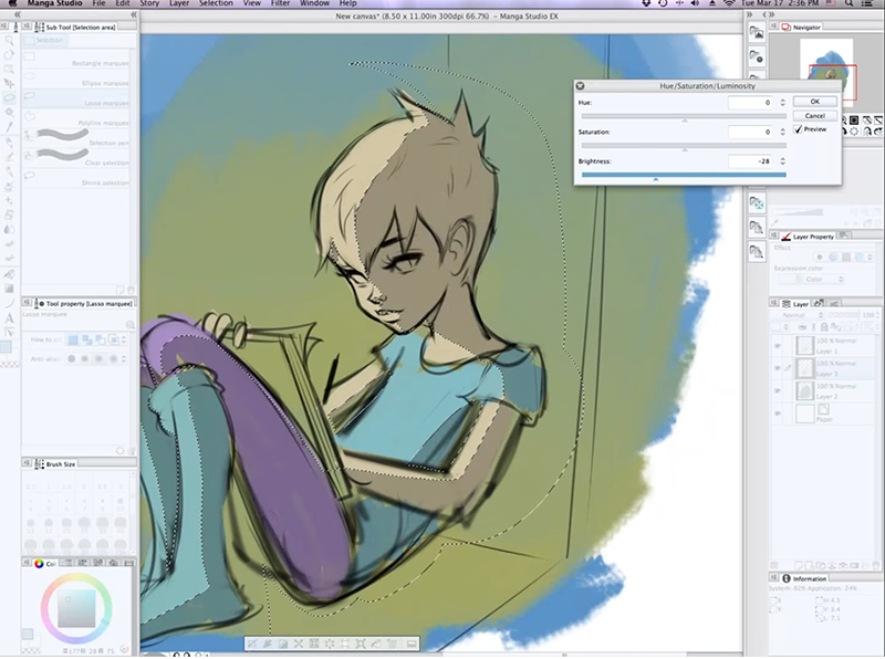
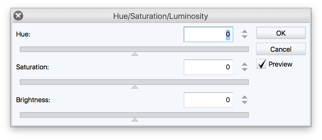
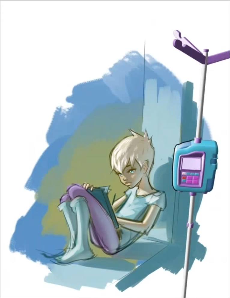
The first of the three isn’t really rocket science, but it was different than the technique I usually employ. At around 35:00, Cumbo starts working on shadows for the image he was sketching. My typical approach to shadows is to create a multiply layer. But Cumbo makes a bunch of selections (not that the “Sarah” figure is on a separate layer than the greenish background) and then does a colour adjustment using Command-U (presumably Control-U on Windoze machines) to bring up an HSB dialog which allows him to lower the brightness of the selected areas.
2. She Comes in Colours Everywhere
The second technique is one I’d love to hear more about because it was a technique that I’d never seen (do you know any other people who talk about a technique like this?)
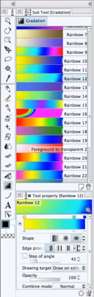
At around 51:00, he does an adjustment to the colours to convey a particular emotion or feel.
The steps are straight-forward:
- Create a new layer and set the mode to “Soft Light” (or, he later suggests, possibly “Overlay”) and drop the opacity down (he takes it down to 31% in the video).
- Create a gradient in the new layer (he chooses from a fairly large list of gradients that he’s apparently pre-made). The one that he works with is a yellow-to-green-to-aqua-to-blue gradient. He uses a circular gradient, and puts the centre at the spot where the light source of the image is. Sarah is sitting in a window, so the light source is likely the sun outside of the window.
The end result is a somewhat subtle colour shift — the new colours are a bit warmer and a little bit more unified.
3. Soft! What Light Through Yonder Window
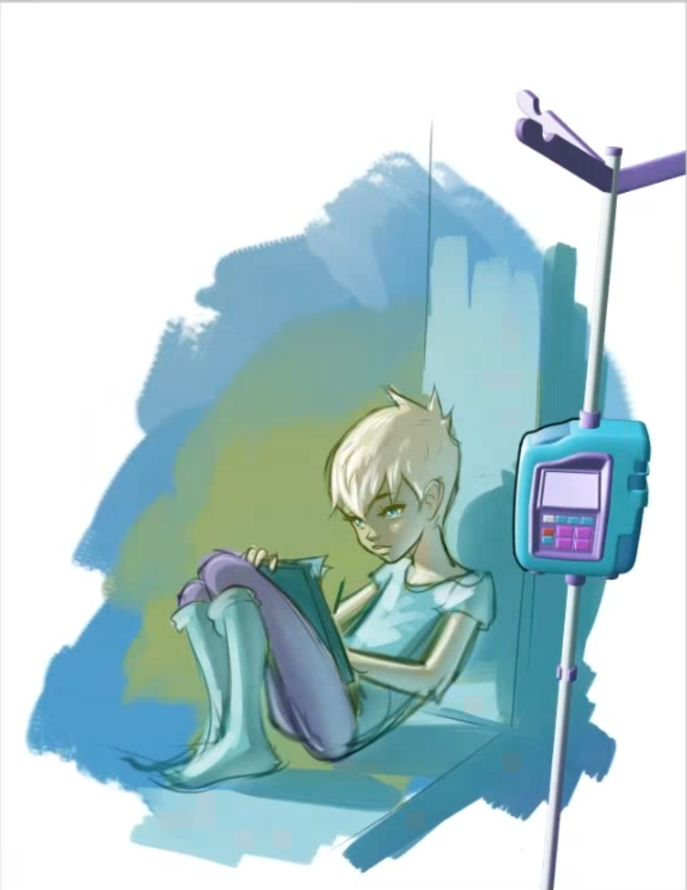
The last technique is a finishing technique, to soften and brighten the overall image. His demonstration starts at 1:08:45. Steps:
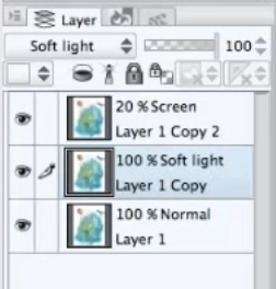
- After the art is “done” he flattens all of the layers together, then duplicates that flattened layer twice.
- To the top layer, he applies a Guassian blur between “about 100 to 120”, sets the layer mode to “Screen” and drops the opacity to 20%.
- To the middle layer, he sets the layer mode to “Soft light”.
He also immediately follows that technique with an interesting glow technique that works very similarly, except that he uses “Add (Glow)” mode on the top layer, rather than “Screen”.