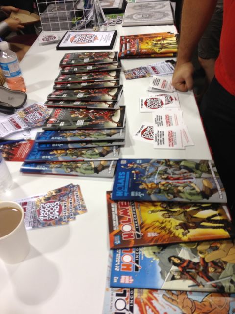
I popped in to FanExpo yesterday, and I got to see the final, printed issues of Holmes Inc #4. Keiren was staffing the Comic Book Bootcamp booth, and had a number of issues available (but not as many as she expected due to the printer having a slight case of being terrible and unreliable. And boy was she smack-talking them).
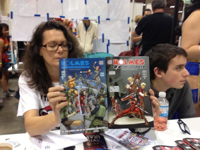
As I mentioned last post, the book has been split into two comics — a 4a and a 4b. Ty posted the cover and info about the 4a book (which happens to include both the story I wrote and the story I illustrated), and then on Thursday he did the same for the 4b book. Take a look at the sample pages — I got to see a lot of this art evolve over time, so that was fun.
 Sam’s story is, I think, the only one that uses non-linear story telling — that allows the story to begin with that wonderful in media res opening of Ryan getting shot. I’m not surprised that this is the opening page of the book, ’cause it’s pretty damn strong. The artist, Dave, did a really nice job of the images. The visuals for this story evolved a lot over the course of the class. The final pages look almost nothing like the first layouts. You gotta admire someone who’s willing to throw out work to get something even better.
Turan’s piece stands out because of his digital painting technique. He both wrote and drew his own story, which is surprisingly dark. I’m most in love with his backgrounds — he really knows how to make an environment come alive. Oliver’s story was illustrated by Ty himself (we had far more writers than artists, so the class had to come up with some creative solutions to art assignments). On the one hand, that’s pretty cool: being illustrated by a pro. But the downside was that Ty’s busy work schedule kept him from having new stuff to show each week, so I saw that story the least. The story itself is a fun piece. One of the things that I like about it the most is that it takes place in China and features no martial arts.
The last two stories had collective art teams. Mike’s story of icebergs and Coleridge was originally designed and laid out by Rachel, but some extra hands were brought in to finish up the art at the last minute. I got to ink a coupl’a Rachel’s pages (terrible inking, by the way — I got pulled in when I was kinda already burned out), and her composition is really quite fascinating. Full of interesting little details, and design elements. Mike (like me, I think) tends toward heavy text. There are lots of places where the text almost obliterates the art. He’s playing with a lot of ideas — sometimes, I think, the weirdest and wildest ideas — and uses the text to sell those ideas. But, yeah, at the end of the day, there’s a lot of text.
The last story was done in a round-robin art style, with a different person at each stage of the art: design, layouts, construction, finished pencils, and inks. Keiren and Ty picked the different artists for each stage, saying that they thought that they were hitting each artists strengths. I think they got it dead-on right, and the art really shines, I think, because each artist played to their strengths. One of the reasons that this story was chosen for the round-robin was that, after our first Pitch night, each artist was asked to list the two stories they most wanted to work on. And everyone included this as one of their picks. And it seems like the big draw was the adversary that’s revealed in the final pages (no spoilers, here). It struck me as a curious thing to see how an odd element of the pitch can make artists say, “That! I want to work on that!”
I am a bad bad person!