I’ve been waffling about posting my final pages. The editor-types don’t want me to post all pages (’cause, hey, people should get the book if they want to see all the pages). But here are a couple.
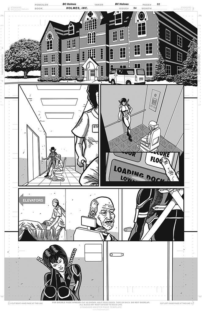
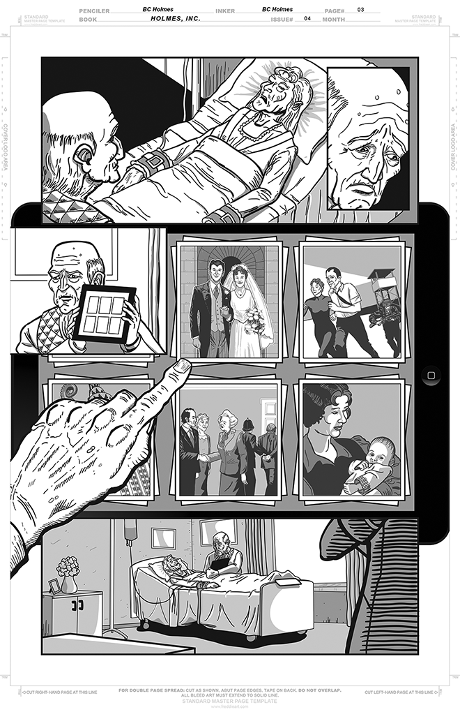
These are pages two and three of the story I illustrated. The writer is Tuhin Giri (he’s also the illustrator of my story), although these pages aren’t lettered, so you can’t actually read any of Tuhin’s words).
I decided, going in to this, that I was gonna use the process to experiment with digital inking. And I knew that the end result would look a bit weaker due to inexperience with this medium. Things I like:
- I’ve been trying to get comfortable with heavier line weights. I ink almost exclusively with a crow quill, and I usually end up with very fine lines. I’ve been trying to get more comfortable with heavier weights, but every time I use a heavier line, I get all mortified and think, Aaugh! That’s too heavy.
- I really like how digital inking really enabled using grey tones to provide some sense of tonal weight. I made a choice early on to stick with a limited number of greys (the “photos” are in a different set of greys, mind you), and although I like the look of using greyscales, I think I shouldn’t have been quite that narrow with my palette.
- The whole process of going from layouts to pencils to inks is a heck of a lot easier when I can do digital paste-up.
- I just, basically, like a heavy black plate, and I think there’s a nice amount of black in these images.
- In general, I tried to follow the script fairly closely in terms of what’s in the panel. The photos on page 3 where a fun area to play with contents. It was interesting to draw the old man in multiple time periods, for example. And to have him shaking hands with Thatcher (you work for the establishment, and this is what happens!) And I think one of my favourite bits is the photo that you can’t see, which has something tentacled attacking the Chrysler building.
- I had fun with research: page 1 (which I haven’t shown) starts off in the old man’s office, which we’ve seen in prior issues with a lot of interesting stuff in it. It was fun to trawl through the past issues and find very specific images about what was in different corners of the room. When I couldn’t find a clear view of a specific thing, I’d invent. I enjoyed that. On the other hand, there’s been stuff that’s been inconsistent in past issues (like, does Trey have a part in her hair or not? Or, are there stripes on the legs of Trey’s uniform?) I find I just hafta make a decision and run with it.
What I don’t like:
- I’m still working out technique for stuff I’ve done with the pen. I find, for example, the building at the top of page two looks very flat. The trees compensate somewhat, but the overall result is uninspiring.
- I think I need to figure out better ways of doing perspective. Here was a case where I’d do the perspective in pencil, and then ink over my pencil lines. But it feels like any perspective errors I make in the pencils look ten times worse in the inks. I feel like digital guidelines will help a lot. More practice will help.
- That limited palette that I mentioned really annoyed me in the panel 3 elevator scene. I threw some white highlights to add some pop, but I think maybe some gradients might have helped.
- This particular story had a lot of panels per page. Page 3, above, had eight panels. Page 4 and 5 had even more. Humina.
- It took me a while to really get a handle on crosshatching with a crow quill. I think I’m gonna need a lot more practice with hatching with a Wacom tablet — it’s hard to really get it right.
So, there are things I like and things I don’t like. I wanted the experience of inking digitally, and this exercise helped, even though there were certain things that would have worked out better if I’d inked traditionally. But I’m happy to have tried something new.
The final book should be out around the end of August; I’ll post about that when I know more.
Oh wow, you are so amazingly talented. The panels are so expressive that they barely even need words.