A few weeks ago, I was thinking about modelling the brig from Voyager. We see a fair bit of the brig in the episode “Thirty Days” where Tom Paris is confined to the brig as the result of disobeying the Captain’s orders.
This image appeared in an official Trek fan publication:
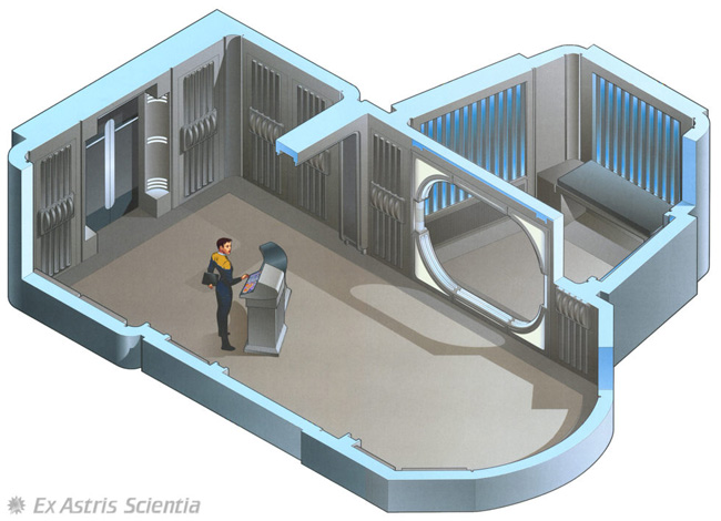
(Paramount authorized an official Trek magazine in the nineties — it often included these kinds isometric-style set interiors and folks have copied, reused and remixed them ever since).
There’s a bunch of stuff I don’t like about the Voyager brig set. First, there seems like a lot of wasted space dedicated to an area that probably isn’t commonly used. Despite how much space it takes, it always struck me as odd that there was only one cell. And, lastly, I find the idea that Trek ships have stations (like the brig guard station) where people are expected to stand all day long a bit unfriendly. People need to sit down.
Often, the demands of the story constrains these things. “Thirty Days” only called for one person to be locked up. Therefore they only needed one cell. Therefore building more than one cell costs extra money for no reason.
So I was tinkering with a different brig design, but never quite got more than a simple sketch of a floorplan put together.
And then, a few weeks ago, a DeviantArt user that I follow posted a brig.
Okay, some background. There’s a guy named falke2009 on DeviantArt, and for a number of years, he’s been posting these incredible SketchUp-based Star Trek interior designs. He also had some cool high-quality renders of his designs using a (Windoze-only) SketchUp plugin called Kerkythia.
When I first encountered him, I’d already had a copy of SketchUp on my machine: it had been mentioned as a tool for helping make comics environments. But falke2009’s work basically tipped me from “I should find the time to learn this some day” to “okay, now I want to figure this out.” (Ironically, just a few days ago, he posted his latest design, and he’s jumped from SketchUp to Blender).
Anyway, a few weeks ago, he posted a brig design that he’d been commissioned to create. It was a nice layout. So, I thought, what if I tried my hand at that?
Of course, I quibbled with things. I decided to model the entrance door differently: falke2009 is using the “reinforced door” that usually appears as the entrance to cargo bays and the like. I decided to use the more-standard Voyager brig door. (There’s a guy named RedGeneral or “radishdalek” who creates really good blueprints of things like the Voyager doors, with all the dimensions marked, so it’s pretty easy to follow those).
There’s also a decorative wall panel that falke2009 has riffed on, but ultimately created his own version of. I preferred to use the wall panel as it appears on the show. And I still believe in giving people a place to sit.
So here’s my version:
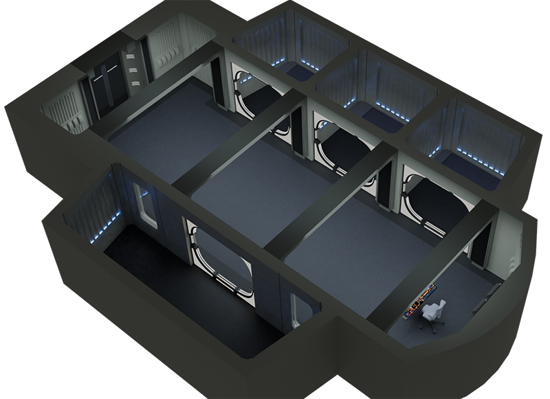
This is easily the most complex thing I’ve modelled in Blender, to date. It’s also a bit of a dark and gloomy lighting set-up. Although the actual set on the show is kind of dark and gloomy, too.
One of the things that took an annoying amount of time to create was the LCARS for the brig guard station. Amusingly, it barely registers as more than a handful of pixels in this final image.
As always, there’s stuff I wish I was better at. The carpet, which looks fairly carpet-y from close up, due to a good texture from Poliigon, just looks flat from this distance. I think some noise might help. But I’d like to experiment more with lighting. I seem to successfully have two modes: washed out or gloomy. More experimentation is the thing.