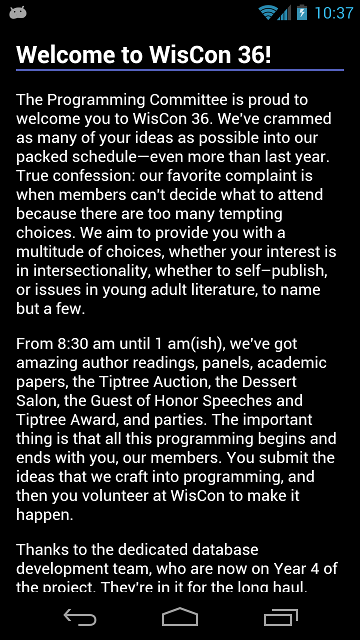
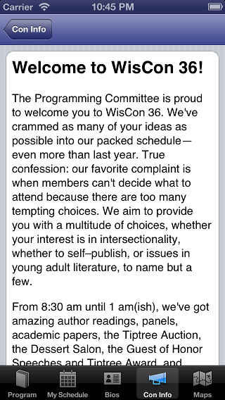
Made some good progress tonight. I’m going to hafta make some decisions about how much theming I’m gonna do. Frinstance: here is a snippet of info from the “Con Info” part of the app:
Internally, I store the content as simple HTML, and on the iPhone, I apply a bit of CSS glory to get a look and feel that approximates an iPhone feel (although I’m getting tired of that grey pinstripe background). Pop the HTML into a UIWebView and we’re golden.
The same general strategy works for the Android: throw the HTML into a WebView. But, in general, my Nexus tends to make very different default theme choices: showing white text on a dark background in non-HTML parts of the app. So I gave the Android version the most basic of CSS styles. This look fits in better with some of the other widget defaults. I’ll probably do some tweaking as I get closer to having a finished version.


