Tag Archive for kamics

Inking experiment 1

I tried my hand, this weekend, on a particular technique for digital inking using Illustrator. I started with a pencil sketch by Jack Kirby (published in one of the Jack Kirby reader books).

Original Pencils by Jack Kirby

I scanned the image and popped it into Illustrator, then saturated it with blue, to make it easier to differentiate the pencils from the inks. I downloaded a specific Illustrator template from Cartoon SNAP, and tried out their inking brushes. Here’s an image in progress:

Read more

Holmes on Holmes, Inc.

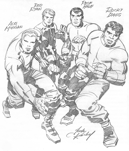
Comics classes are keeping me on my toes, these days. I finished up my “Drawing the Human Figure From Your Head” class on Monday (excellent, excellent class, by the way… I’ve taken both life drawing and constructive drawing during my cartooning program, and this class really clicked in a way that the other classes did not). Both this class, and the one before it (“Heads, Hands and Faces”) went at a bit of a breakneck pace — my head was full by the end of each night.

Holmes, Inc. issue 1
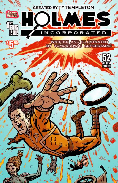
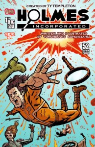
Last night, I started the intense workshop class, “Holmes, Inc.” There are something like 15 of us, and the end result of the class is gonna be an anthology of stories involving the “Holmes, Inc.” agency — the descendants of Sherlock, Mycroft and Dr. Watson. Last night, Ty also suggested that they’re a bit like the S.H.I.E.L.D. of their universe, too, which made me go, ah, yes, of course! This will be the fourth issue of Holmes, Inc. — each of the other three is available for free (as in beer, not speech 🙂 on Drive Through Comics. There is a lot of variation in style and experience in the various stories, but they’re fun to read, running the gamut from egotistical displays of deduction to monster-fighting to moral quandaries.

Read more

Inking

My latest quest is to figure out digital inking. I really like working with india ink, and I like the look of a well-inked piece. Part of my problem is that I’ve reached a certain skill level with pen and ink, and I’m resisting having to relearn: I want my skill with digital inking to be immediate!

There seems to be two main schools of digital inking: the brush school and the pen school. Here’s a pen example:

And here’s a brush example:

Read more

Uniform lines

I’m playing with my Red Exodus cover today — I’d like to finish a good first version of it. Two things are tricksy. First, getting a certain amount of smoothness of line has taken practice. Oh well; we learn by doing.

The second thing is that I needed to do a bit of research about Soviet military uniforms, which has been harder than I wanted. Even though my story takes place in an alternate-history in which the Soviet Union is still around in 2013, I wanted some amount of accuracy about Anatoly’s uniform. What does an Army captain’s uniform look like, precisely? What insignia indicates “officer” and “captain”? I’m not one of those people who normally pays attention to military uniforms (unless we’re talking about the gold braids on the Star Trek uniforms!) and I’m sure that there’s lingo that would make this search easier; I just don’t know any of that lingo.

Read more

More on comic book lettering

I’m continuing to practice different things related to constructing comics. As a simple lettering exercise, I decided to re-letter my final assignment from my cartooning programme.

In this case, I’m retaining the original hand-drawn caption boxes, but I’ve whited-out the original uneven hand-lettering and plopped in some new lettering. I’m using a 12pt font — specifically a font called Digital Strip by Blambot. 12pt is closest in height to the original hand lettering. (To be clear: that’s 12pt on the original art size of 11″ x 17″) I’m also using a bit of Engravers MT on page 4. In almost all cases, the computer lettering is more compact than my hand lettering, so the caption boxes are sometimes a bit empty-seeming.

There are things about Illustrator that I find irritating and more complex than necessary. Like, why do I use different tools to add path points and remove path points? Inkscape feels ever so much better at this to me. But whatever. A tool’s a tool.

Read more

No News is Good News

I’m loving my current class — a drawing course on heads, hands and faces. Over the last four weeks, we’ve been slowly but surely improving our understanding of these body parts.

“all those letters that you wrote to yourself but could not address”

Over the last few days, I’ve been trying to get my head around digital lettering. At one level, this doesn’t seem like a hard topic. I mean, I’ve been dropping words on computer screens for a long, long time. But I’m really interested in figuring out what people in the comics industry are doing: what are typical workflows? Best font sizes?

DC Comics Guide to Coloring and Lettering

To get some insights into the topic, I picked up a copy of The DC Comics Guide to Coloring and Lettering by Mike Chiarello and Todd Klein. I must confess that I was pretty disappointed. A big part of what the book has to say about lettering is about the debate between hand-lettering versus digital lettering. And I suspect that that conversation is kinda dead. Ah, well. The book is from mid-2004: it’s interesting how quickly dated it’s become.

Read more

Going digital

I’m currently on vacation. Which, y’know, is pretty awesome. I spent a coupl’a days in do-nothing mode, sitting on my couch and watching movies. Which is about all that I’m capable of when work has drained me somewhat.

But now I’m in pet-project mode: I want to focus on something interesting. My pet project has been about going digital on the cartooning stuff. None of the instructors I’ve had have been terribly positive about computer-based art. Anthony (my primary instructor during my cartooning programme at George Brown) didn’t quite poo-poo digital art, but fundamentally believed that one had to learn how to draw using traditional tools before learning digital art. He also felt that most of the computer-produced art that he’d seen was very flat and lacked expressiveness.

Ty hasn’t taught us anything related to computers — he seems to draw and ink using traditional media, but he uses tools that Anthony would have turned his nose up at (markers! Pen brushes! Oh noes!) Ty also seemed to think that it was pointless to learn hand-lettering because nobody hand-letters these days. (I notice that Bechdel’s Are You My Mother? seems computer-lettered, whereas Fun Home looked hand-lettered). And Ty’s Bun Toons often include digital colouring and probably a bunch of other computer tweaks. So he seems more pragmatic about the use of computers than Anthony ever did.

Read more

Final Thoughts on Writing for Comics, Part 2

I meant to make a post about how my final class for “Writing for Comics, Part 2” went — I was pretty pleased with the final class, and I can’t help but wonder if my complaints about class number 6 had more to do with me and my state of mind than it had to do with the contents of the class.

I think that one way to evaluate the overall course is to look at what I got out of it. And there, I think, I hafta confess that I got some pretty good tools for putting together a whole comic script. Here’s what I have today:

Read more

Holidays

I like this card, created by Michael Cho in 2009:

Happy Anti-Life everyone.