Archive for Comics

Thumbnailing

I’ve been taking a new cartooning course, and our first project involves scripting and thumbnailing. So I’ve been thumbnailing over the past few weeks.

Ty always argued that thumbnails should take you 10 minutes. They take me quite a bit longer than that. I’m also weird in that I really like figuring out my lettering early in the process, ’cause I hate lettering that doesn’t fit into the panels.

Mostly my thumbnails start very scribbly, and then I refine them as I want to figure stuff out. Some parts I just leave as scribbly if I have a clear idea of what it’s saying. Stuff that involves a lot of environment, I end up spending more time on.

Read more
Prism

Moar Trek

I’m still playing with Trek images. Here’s another character from our Trek RPG group:

There are some inconsistencies in the face that I wish were better, and the scale on her hand in lower left version bugs me.

But mostly I was playing with how the character looked in different eras.

I ended up not inking this piece: just coloured under pencils.

Shout-out

I went down to Glad Day book store tonight: we had a bit of a launch party to celebrate that we’ve officially started the Kickstarter campaign for the Shout Out anthology.

Our publisher, Steven Andrews, has done an amazing job on the Kickstarter planning as well as organizing the graphics, rewards, and video script. He’s hired a very good video editor: the video looks really nice. And he showed up at the launch party with some preview samples. (They even say “Special Preview” on the cover!).

The response to the Kickstarter has been amazing. As I’m writing this, we’re thisclose a third-of-the-way funded on day one.

ShoutOut

Clip Studio Tutorial Video

I think I first encountered this video at least a year ago. Maybe two. It’s one of a series that Smith Micro Graphics made to raise the profile of Manga Studio (now called Clip Studio Paint and Manga Studio Ex is now called Clip Studio Pro).

The presenter is an artist by the name of D.M. Cumbo, who has been working on an illustrated story called Dreamside. At about the time that Smith Micro released the video, D.M. Cumbo was also making a number of videos about different Manga Studio techniques, but he’s gone a bit quiet on that front lately.

Cumbo’s art really stands out to me because of the vibrancy of colour that he achieves. In a later video, he says that vibrancy is really all about contrast, and that picking colours that contrast well is the key to creating vibrant images. He also really pushes the idea of bounce-back lighting in a number of his videos: he says that things really look “in the environment” when you can see the colours of the environment reflecting back on a figure or object in that environment.

There are three techniques that Cumbo describes in this video that interest me:

Read more

Toronto Comics Volume 3 Review

She Comes in Colours Everywhere.

I’m continuing to pour a lot of my creative energy into comics. I’ve had a few things going on in that world.

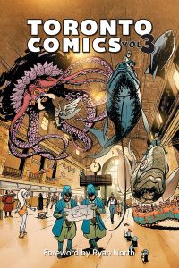
Toronto Comics Volume 3 - smallFirst up, I’ve taken part in the third volume of Toronto Comics (the book seems to have dropped the “Anthology” part of the name). I wrote a story this year — “Lofty Aspirations” — but didn’t draw it. Instead, it was illustrated by Xan Grey, an amazingly talented artist, who’s been in the last two anthologies.
Read more

A Page of Me

Well. This is interesting.

Scrivenering and Scripts

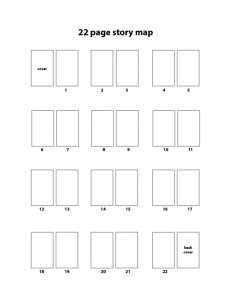
22-page story mapOne of the things that Ty taught in his writing class was story maps. Basically, (in the form he was teaching us) they’re a simple device for planning a basic comic script. Obviously, story maps aren’t unique to comic writing, but Ty’s technique for using them is pretty specific to mainstream comics publishing.

Here’s an example of a story map that he filled out — I’ve seen this particular example used to provide a visual aid for his Writing Comics course. He also hands out blank versions in his class — I scanned one and redrew it in Illustrator because I like doing stuff electronically.

Read more